Introduction to Data Exploration with Python
Before building any machine learning model, the first and arguably most important step is understanding your data. Exploratory Data Analysis (EDA) helps you uncover patterns, spot anomalies, identify relationships between variables, and form hypotheses — all before writing a single line of modeling code.
In this post, we walk through a complete EDA workflow using the sklearn diabetes dataset. We cover loading data into pandas DataFrames, converting to numpy arrays, visualizing distributions with histograms, creating scatter plots with colormaps, and building pairwise correlation grids.
1. Importing Libraries
Every data science project begins with importing the core libraries. The Python ecosystem provides a powerful trio for numerical computing, tabular data manipulation, and visualization:
import numpy as np
import pandas as pd
import matplotlib.pyplot as plt
from sklearn import datasets- NumPy: The foundation for numerical computing in Python. Provides efficient n-dimensional arrays and vectorized operations.
- Pandas: Built on top of NumPy, it offers DataFrames — labeled, tabular data structures with powerful indexing, grouping, and reshaping capabilities.
- Matplotlib: The most widely used plotting library in Python. While higher-level libraries like seaborn exist, understanding matplotlib gives you full control over every aspect of your figures.
- Scikit-learn: Beyond its modeling capabilities, sklearn includes convenient dataset loaders that are perfect for learning and benchmarking.
2. Loading the Dataset
The sklearn diabetes dataset contains 442 samples with 10 baseline variables (age, sex, BMI, blood pressure, and six blood serum measurements), all of which have been mean-centered and scaled. The target variable is a quantitative measure of disease progression one year after baseline.
diabetes_dataset = datasets.load_diabetes(as_frame=True)
print(diabetes_dataset["DESCR"])
The as_frame=True parameter returns the data directly as a pandas DataFrame rather than a raw numpy array. This preserves feature names as column headers, making exploration much more intuitive.
# Access features as a DataFrame
df_data = diabetes_dataset["data"]
df_data
The DataFrame shows 442 rows × 10 columns, with features like age, sex, bmi, bp, and serum measurements s1 through s6. All values are pre-processed floating-point numbers centered around zero.
DataFrame to NumPy Conversion
While pandas DataFrames are excellent for exploration, many machine learning algorithms and custom implementations work with raw numpy arrays. Converting between the two is straightforward:
# Convert DataFrame to numpy array
X = df_data.to_numpy()
print(type(X))   # numpy.ndarray
print(X.shape)   # (442, 10)

# Target values
t = diabetes_dataset["target"].to_numpy()
print(t.shape)    # (442,)
The feature matrix X has shape (442, 10) — 442 samples, each with 10 features. The target vector t has shape (442,) — one continuous value per sample representing disease progression.
3. Histogram Visualization
Histograms are the first tool to reach for when exploring a new dataset. They reveal the distribution shape, central tendency, spread, and potential outliers of each variable.
Target Distribution
# Histogram of target values
plt.hist(t, bins=20)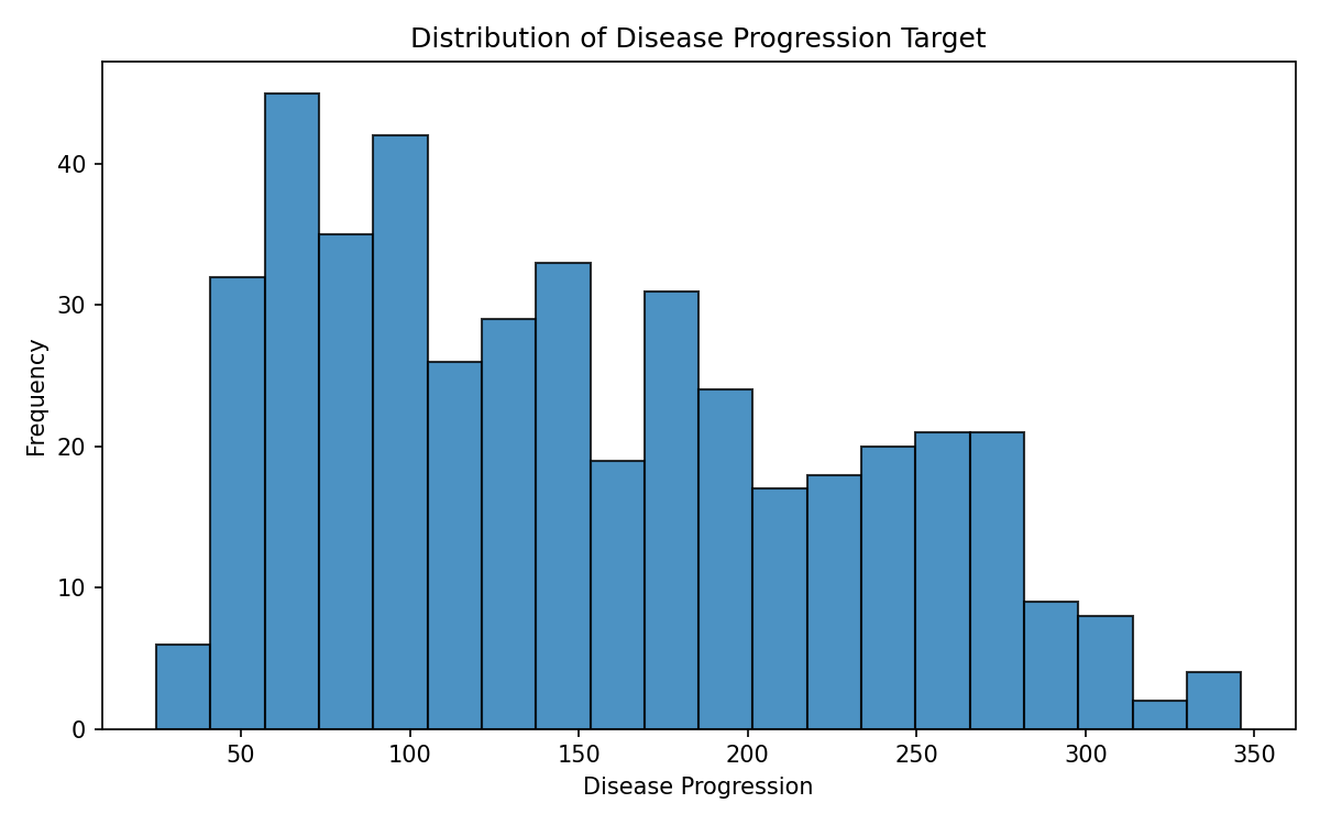
The target distribution is right-skewed, with most values concentrated between 50 and 200, but a tail extending beyond 300. This skewness is common in medical datasets and may influence model choice — for instance, tree-based models handle skewed targets naturally, while linear models may benefit from a log transform.
Individual Feature Histograms
For more control over the visualization, we can explicitly create figure and axes objects. This pattern is essential for publication-quality plots:
fig = plt.figure(figsize=(10, 4))
ax = fig.gca()
ax.hist(X[:, 0], bins=24)
ax.set_title("Age")
Multi-Panel Histograms
When comparing multiple features side by side, subplots keep the visualization compact and aligned:
fig = plt.figure(figsize=(10, 12))
axes = fig.subplots(nrows=3, ncols=1)

nbins = 36

axes[0].hist(X[:, 0], bins=nbins, color="lightblue")
axes[0].set_title("Age")

axes[1].hist(X[:, 2], bins=nbins, color="lightgreen")
axes[1].set_title("BMI")

axes[2].hist(X[:, 3], bins=nbins, color="beige")
axes[2].set_title("BP")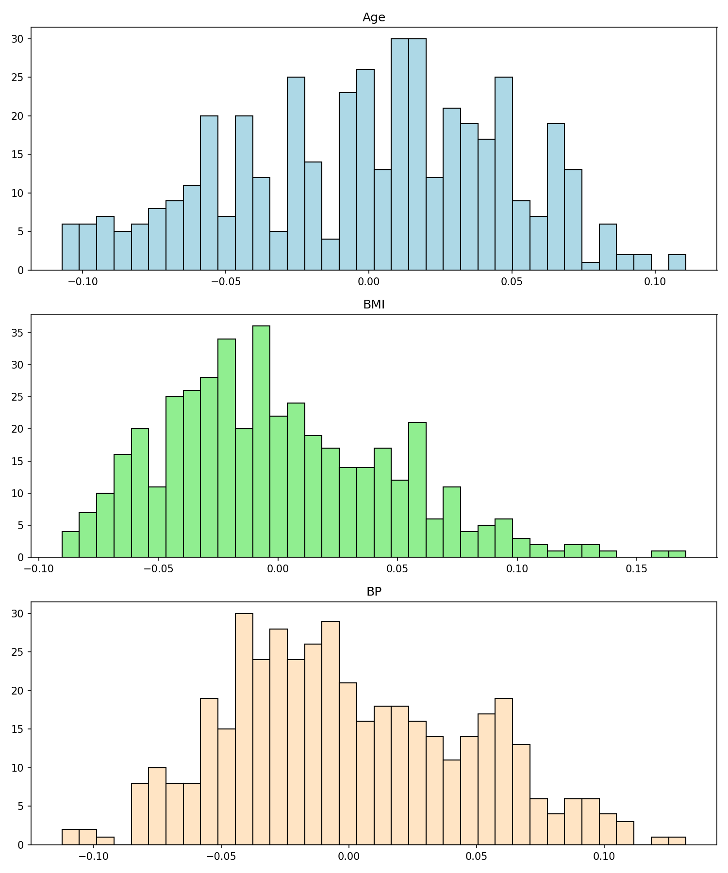
Key observations from the feature distributions:
- Age: Roughly symmetric, centered near zero (due to standardization). The age distribution appears approximately Gaussian.
- BMI: Slightly right-skewed, suggesting a few patients with notably higher BMI values compared to the mean.
- Blood Pressure (BP): Also approximately Gaussian after standardization, with a slight right tail.
4. Scatter Plots with Colormaps
Scatter plots reveal relationships between pairs of variables. By mapping a third variable to color, we can visualize three dimensions simultaneously on a 2D plane:
fig = plt.figure(figsize=(8, 6))
ax = fig.gca()

# Color points by target value
scatter_plot = ax.scatter(X[:, 0], X[:, 2], c=t)

ax.set_title("Age vs. BMI")
ax.set_xlabel("Age")
ax.set_ylabel("BMI")
ax.set_xlim([-0.15, 0.15])
ax.set_ylim([-0.15, 0.15])

fig.colorbar(scatter_plot)
fig.tight_layout()
The colormap encoding reveals a clear pattern: higher disease progression values (yellow) tend to cluster in the upper-right region, where both age and BMI are above average. This suggests that the combination of higher age and higher BMI is associated with more severe disease progression — a medically intuitive finding.
The c=t parameter maps the continuous target values to a color gradient. The colorbar() method adds a legend showing the mapping from color to target value. This technique works with any continuous or categorical variable and is one of the most effective ways to explore three-way relationships.
5. Pairwise Correlation Grid
When a dataset has many features, examining every possible pair of scatter plots gives a comprehensive view of inter-variable relationships. A pairwise scatter plot grid (sometimes called a scatterplot matrix) places feature i on the x-axis and feature j on the y-axis for every combination:
fig, axes = plt.subplots(nrows=4, ncols=4, figsize=(12, 10))

for i in range(4):
    for j in range(4):
        if i == j:
            # Diagonal: scatter feature vs. target
            axes[i, j].scatter(X[:, i], t, c=t)
            axes[i, j].set_xlabel(diabetes_dataset.feature_names[i])
            axes[i, j].set_ylabel("disease progression")
        else:
            # Off-diagonal: scatter feature i vs. feature j
            axes[i, j].scatter(X[:, i], X[:, j], c=t)
            axes[i, j].set_xlabel(diabetes_dataset.feature_names[i])
            axes[i, j].set_ylabel(diabetes_dataset.feature_names[j])

fig.tight_layout()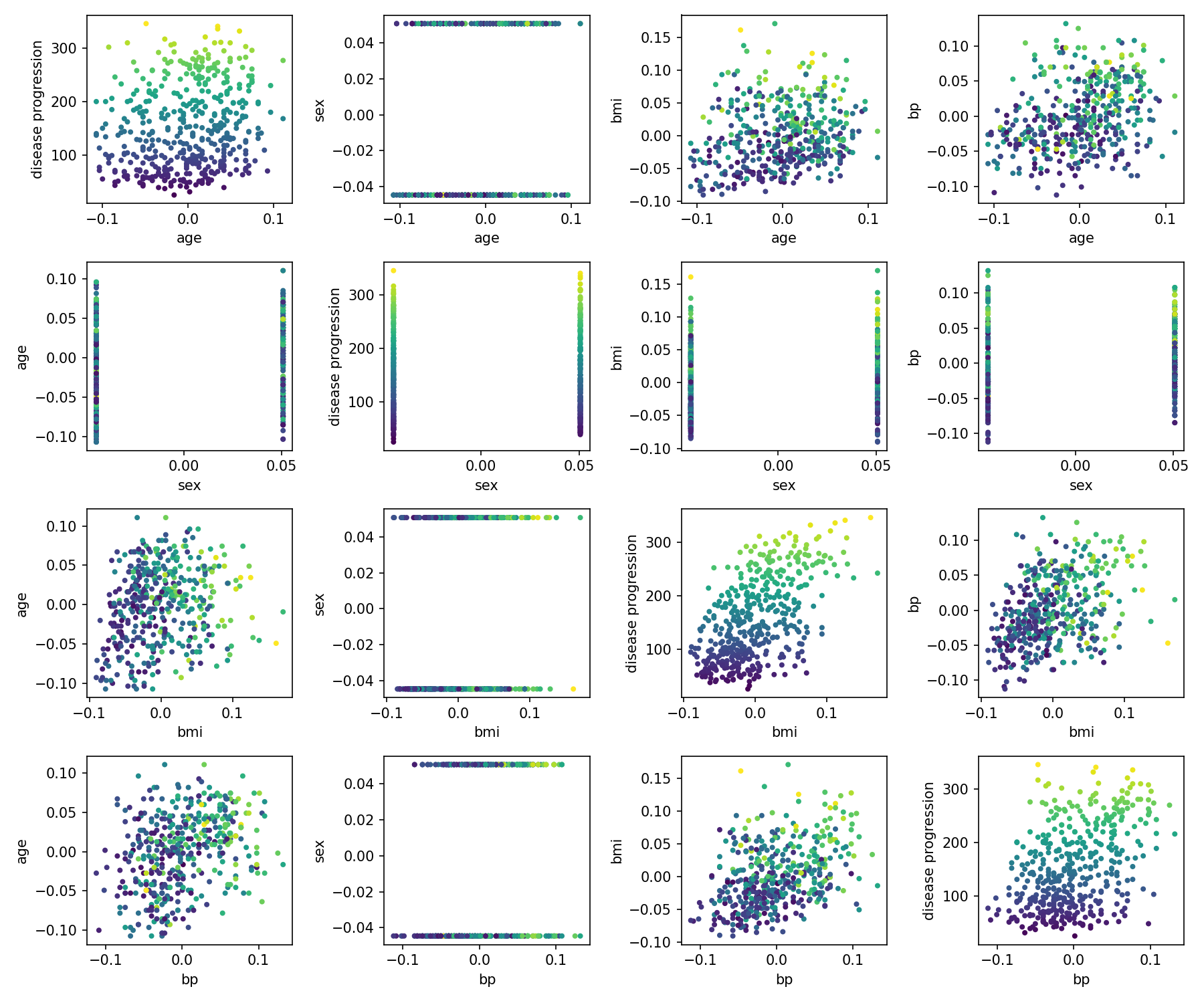
Reading the pairwise grid:
- Diagonal panels: Each feature plotted against the target variable. The
bmivs. target panel shows the clearest positive correlation — higher BMI is strongly associated with higher disease progression. - Off-diagonal panels: Feature-to-feature scatter plots colored by target. Look for clusters, linear trends, or non-linear patterns. If two features create clearly separated color bands, they may be jointly predictive.
- Symmetry: The grid is symmetric across the diagonal (panel (i,j) is the transpose of (j,i)). This redundancy is intentional — it allows you to read along any row or column to see how one feature relates to all others.
This visualization technique scales to any number of features, though beyond 6–8 features the individual panels become too small to interpret. For larger feature sets, consider selecting the most correlated features first (e.g., using a correlation matrix heatmap) and then plotting the top candidates.
6. Key Takeaways
"Look at your data before you model it."
- Start with the data structure: Understand the shape, types, and meaning of each column. Use
df.shape,df.dtypes, anddf.describe()to get a quick summary. - Histograms reveal distributions: Check for skewness, multimodality, and outliers. These properties influence your choice of normalization, loss function, and model family.
- Scatter plots reveal relationships: Color-coded scatter plots let you visualize three variables simultaneously. Look for clusters, linear trends, and non-linear patterns.
- Pairwise grids give the big picture: A scatterplot matrix helps you identify the most promising feature combinations before modeling. Focus on pairs that show clear separation by the target variable.
- Pandas and NumPy interop: DataFrames are ideal for exploration (labeled axes, built-in plotting), while numpy arrays are required for most ML algorithms. Convert freely between them with
.to_numpy()andpd.DataFrame().